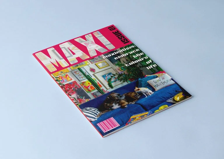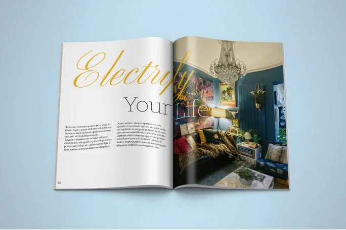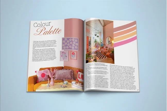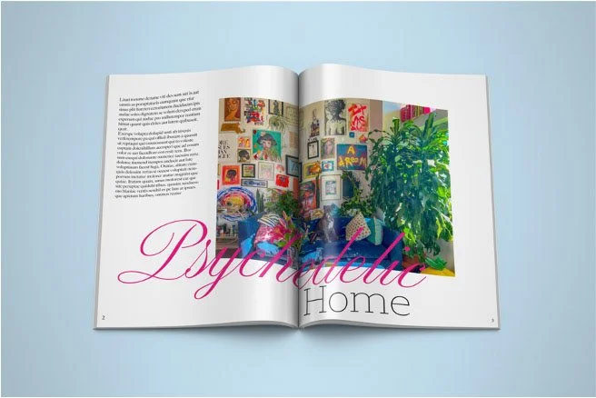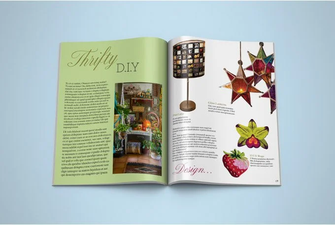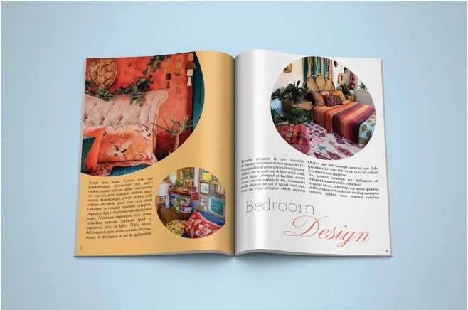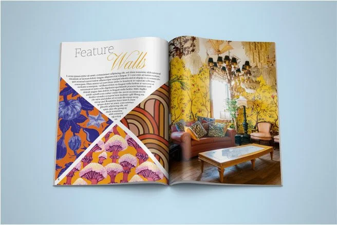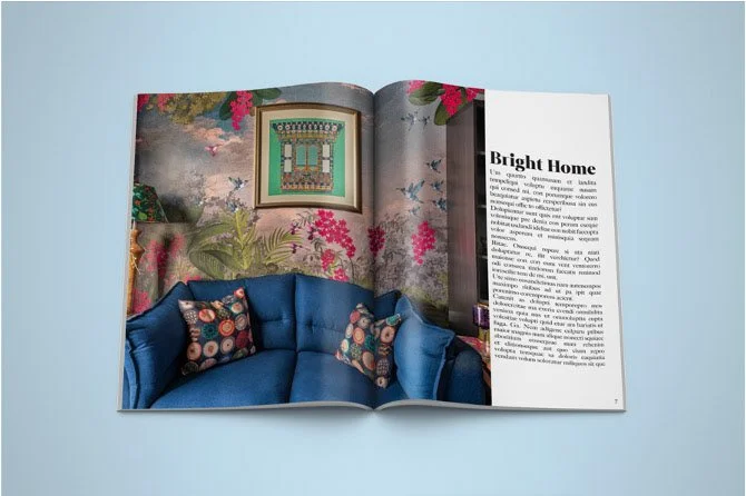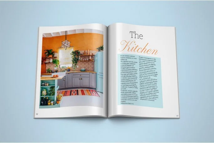
This project was a concept design for a life style magazine focusing on maximalist style interior design. Maximalism is a style based around bright colours, vibrant patterns and attention to detail, favouring a ‘more is more’ lifestyle. The goal of the magazine is to showcase different types of maximalism in interior design with the design of the pages taking inspiration from the styles key traits, making the magazine a love letter to the style. MAXI’s lettering on the front page is purposefully transparent so that the images themselves can do the talking. While colour and vibrancy flows through the pages, each layout is also met with a layer of subtlety so as to not take away from the imagery, articles and advertisements. I also wanted the reader to be persuaded into reading further instead of flicking through the pages by making each page unique in its design with the colours and shapes featured in the layout always being inspired by the images on the page. Functionality is extremely important when designing a page layout so despite the vibrant design each page is readable and accessible.